Mathematics is not only logical. It is beautiful.
Phi & Form began with a simple question: what happens when
people are given the freedom to explore mathematical ideas
directly? Not as equations on a page, but as shapes under their
fingers, colorful, tactile, and alive.
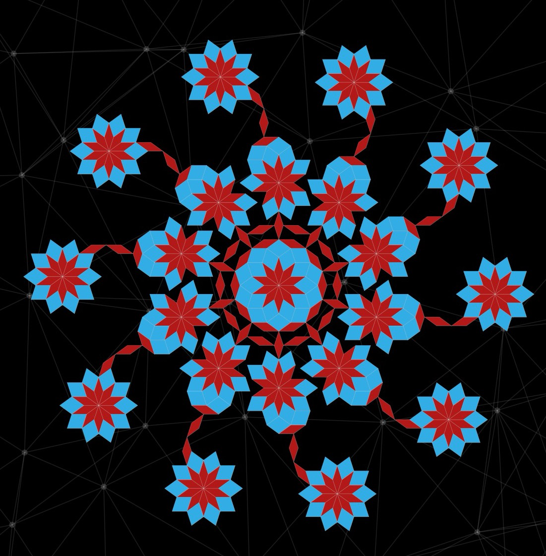
The origin
Born from a fascination with the geometry hidden in plain sight.
Phi & Form started from the desire to encounter mathematics
directly through pattern, shape, and visual structure rather
than through abstract explanation alone.
The philosophy
We don’t simplify math. We make it something you want to touch.
Every app begins with a mathematical idea, aperiodic tilings,
symmetry systems, geometric proportions, and transforms it into
an experience that feels natural and intuitive. No tutorials
required. The math reveals itself through play.
The vision
A growing collection of apps where every pattern has a story.
Four tile families are just the beginning. Fractals, spirals,
tessellations: each one offers a new way to explore the hidden
architecture of the world. Every app opens onto a different
corner of mathematical beauty.